.jpg)
Website
Redesign
About
This project is to re-design a website of non-profit organization, Japan Creative Center.
Tools Used
Keynote, Illustrator, Photoshop, InVision
Background
Re-designing a website for a non-profit organization. While the content is very informative, I feel that the visual design and menu layouts could be improved to not only make it visually captivating but pleasant to navigate.
1. USER EXPERIENCE
ABOUT JAPAN CREATIVE CENTER

Japan Creative Center (JCC) was set up in 2007, as a result of the Japan-Singapore Summit Meetings. It is the first of its kind outside Japan which acts as a base for sharing information on Japanese Culture and Technology trivia.
Goal : Increase traffic to website, targeted at Singaporeans
Challenge : Not many are aware of various resources available online
The non-profit organization have been attracting two types of visitors,
one is the casual visitors who are always on the look out for interesting
events to attend or things to read, while the second one is
the Japanese Culture enthusiasts, our ideal target audience.
As such, we establish the persona of JCC web user which best represents the users and determine the task scope in the re-design.
TARGET USERS
USER PERSONA

Searching for the desired information can overwhelm the user and induce online fatigue. So the aim is to reduce cognitive load.
Humans are visual learners who process and digest visual information easily as we have short attention span due to our hectic and fast paced lives.
A pleasant and simple user journey experience will bring the existing users back and new users to the website.
-
Overwhelming Info
-
Online Fatigue
-
Time Consuming
-
Simplify user flow
-
Re-categorize options
-
Visually captivating
Issues
Solutions
Increase traffic to web
2. WEB ANALYSIS
UX WALKTHROUGH OF CURRENT WEBSITE
My first impression on the website is that it feels a little outdated, in terms of visual design and menu layout as I feel like there's a cluster of information on scattered on the page that I need time to look around every option to know what is what.

JAPANESE UX/UI WEB DESIGNS
It is interesting to note that the reason why JCC is using such a layout is because they use the same form of design used in Japan, as Japanese people prefers more information on the website to aid them in their decision making.
It is a way to build trust with the customers, so the more information they get from that website, the better it seems to be. So this affects the user flow and UI design you will commonly see in Japanese websites, which is very different than everywhere else.
But in this case, the target audience for JCC is Singaporeans and not Japanese. So we have to change, in order to adapt to the user behaviours of Singaporeans, who prefers a simple layout and minimalistic design.

Example : Rakuten Ichiba, a Japanese electronic commerce and online retailing company based in Tokyo.
INFORMATION ARCHITECTURE & CARD SORTING
There are too many options on the home page. This overload of information may discourage visitors from exploring all the options, causing confusion or fatigue.
Current
The goal is to declutter and organised the home page while giving it a simple and fresh new look.
Visitors will understand what they are looking at, at one glance and make their surfing experience a pleasant one.
We did a "card sorting" to organise the options into relevant groups and re-label them accordingly.

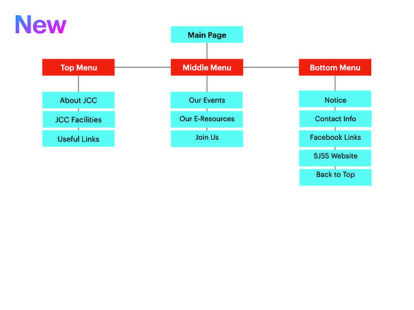
New
-
Remove repetitive options like Facebook link
-
All events related options pushed to "Our Events"
-
E-Magazine and E-Library pushed to "E-Resources"
-
Join Us and Friends of JCC pushed to "Join Us"
TASK FLOW

The Scenario :
You are interested to know what online resources are available.
The Tasks :
1) Search for "E-Magazine" to read the September issue.
2) Search for "E-Library" to see what resources are available.
3. PROTOTYPING
LOW FIDELITY


HOME
E-RESOURCES
E-MAGAZINE
E-LIBRARY
MAGAZINE ISSUE
HIGH FIDELITY


E-RESOURCES

E-MAGAZINE

E-LIBRARY
HOME

MAGAZINE ISSUE
JAPAN CREATIVE CENTER WEBSITE

Your tasks is to search for E-Magazine September issue
OR search for E-Library
4. ITERATIONS
HOME

The top part is the highlight reel portion, which tells visitors what the page is all about and retain the photo gallery slide.
Essential information like "About", "Facilities", "Links" and "Contact" details are placed on the top row.
I use Japanese-like elements, like the zen brush stroke, traditional patterns, cherry blossom and the iconic rising sun.
I retain the 3 colours of red, black and white, which is the "identity" of the organization.
The red patterned circle on the left represents tradition while the minimalist red circle on the right represents modernity,
just like the Japanese Kanji Characters on the left and the English Words on the right.
I chose the photos which I felt best represent what each option consists of.
Additional information like updates/notices are placed at the bottom, along with contact information and social media links.
E-MAGAZINE

Users can search the catalogue by year and month, instead of scrolling down the entire list to as far back as 2014.
The photo gallery format is square instead of rectangle to minimise scrolling so users can see all at one glance.
MAGAZINE ISSUE

The goal here is not to overload users with too much words so I sum up every section to let them know what the post is about and include photos to give them a better idea.
The list of events is in a bold red portion, to get the user's attention who is by this time have a reading fatigue.
A photo is included to give users an idea of what the event is about.
E-LIBRARY

The categories are clearly labelled, each with a different icon.
There is a photo of the book cover for user knows what it looks like, without having them to search for it elsewhere.
SELF-REFLECTION

If I were to fully commit to this project into re-designing the entire website,
I would:
-
conduct user research and interviews to know user's experience and thoughts on the current website, how they might improve it and discover their ideas of a good website
-
conduct visual design research, based on what the users are looking for in the website and what type of image or identity the organization wants to present to the public
-
search for more variety of illustrations and icons to be used for different pages
-
take high quality photos of the center to give users an idea of the atmoshphere
-
insert "monthly feature" for every category of the "E-Library" section
-
insert "Instagram feature" to share the best Instagram photo of their Japan trip
This is the first time I re-design a website and this is what I learnt :
-
the challenge of retaining the layout and order of content as much as possible while giving it a fresh new look, to respect the organization's branding/identity and to avoid confusing regular visitors who are accustomed to the old website
-
the more I try to simplify the menu and options in making the website to look more cleaner and easier to navigate through, the more complex the website flow chart and system architecture becomes
-
the challenge of making a more creative and visually captivating design while retaining the limited colour themes of red, white and black
-
ultimately, it is a matter of balancing between creating a visually captivating website design and providing a pleasant user experience to visitors